Bar Chart for New Client Tier Data
- Jill Thonssen
- Nov 17, 2022
- 3 min read

The first change I made to the data was to flip the ‘A’ and ‘A+’ tier information in the Excel spreadsheet so that ‘A+’ showed first. That is the logical order.
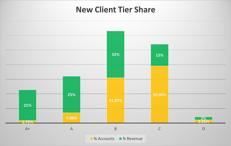
I did have an issue with the fact that neither percentage column equated to 100% and the data did not tell me why. For instance, the percentage of accounts only totaled 81.16%; where is the other 19%??? Is there another tier that is not listed? Why is it not listed? What data is missing? The revenue percentage was better with a total of 95% but this would also benefit from an explanation as to why was it not 100%?
Additionally the overall chart information was unclear to me in that there was no timeline and no explanation of a ‘new client’. What constitutes a new client? If I brought in a new client in, say April, at the tier B level is that new client still part of this data? So it is data for the year or data for a quarter? Or a month? No way to know. Also no explanation of the different tiers.
In looking at the data, I would infer that Tier B is where the company receives the most revenue (both in actual dollars and by percentage) so Tier B is where I would want to focus my attention and resources. I would also infer that Tier D is not worth our time or effort; very low revenue dollars and percentage, so why spend any company resources on that tier? Of course, I could be wanting to show this very thing by using the chart and data! I could be proposing to management that Tier D is a waste of resources so we need to eliminate that tier and focus more on Tier B clients.
This chart and data are an excellent example of why you should not look at just one piece or aspect of data. Looking at the Tier A+, it shows only a few new clients and a low overall percentage of clients yet Tier A+ brings in one-fifth of the revenue. So those clients are definitely worth time and effort.
When selecting the design for the chart or chart style, it was a bit of a struggle because the percentages did not add up to 100%. I chose the stacked bar chart because I felt it provided the best visual for showing the data I wanted to highlight: the importance of Tier B clients and the high revenue from Tier A+ clients even though their client percentage was very low. So the stacked bar chart emphasized those two data points.
I chose to only display the percentages in the chart and not the actual number data. I felt trying to mix the different variables onto one chart would be too confusing. And my focus was on percentages. Again, going back to the data on Tier A+ clients, I don’t really care that there are only 19 of those accounts; I care that Tier A+ represents 21% of the revenue.
I changed the bar chart default colors because I wanted the revenue percentage bar to be green; green for money! The yellow was simply chosen as a complimentary color for the green. Also both colors work with color blindness. I also made sure to include the percentage labels on each bar to ensure the percentages were clear and I felt it was easier to read with the labels. Otherwise a viewer would need to do their own math when looking at the chart.
Here is the chart I created –
Jill


Comments